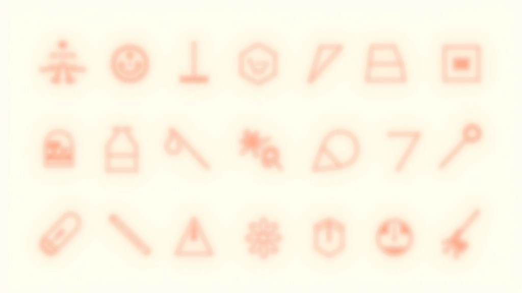
Building a Cohesive Icon System
How to create icons that look intentional together. We cover grid systems, stroke consistency, and creating visual harmony across your entire icon set.
Read moreBalancing visual interest with usability. Learn when illustrations add value and when they become clutter in your interface design.

We’ve all seen them — interfaces so decorated they’re almost impossible to use. Illustrations that look stunning in isolation but feel completely out of place once you’re trying to accomplish something. The challenge isn’t whether to use decorative elements. It’s knowing which ones actually serve your users.
Decorative illustrations and icons aren’t frivolous additions. When done right, they guide attention, establish personality, and make complex interfaces feel approachable. The difference between an element that enhances and one that distracts comes down to intentionality and restraint.

Every decorative element you include should answer one simple question: what’s it doing here? Not in a poetic sense, but functionally. Does it clarify a concept? Draw attention to something important? Help users understand where they are in a flow?
In Malaysia’s growing design community, we’re seeing more sophisticated approaches to decoration. Instead of adding flourishes everywhere, designers are being selective. An ornamental line might break up dense text. A small illustrated icon next to a label might make it instantly recognizable. These aren’t just pretty — they’re solving problems.
The strongest decorative systems start with constraints. What’s your palette? Three colors or eight? What’s the style? Will you use outlines or filled shapes? Are curves organic or geometric? These decisions make everything that follows feel cohesive rather than chaotic.
Different approaches for different contexts
Single-stroke icons and subtle line ornaments. They’re elegant without demanding attention. Perfect when you need decoration that stays in the background and doesn’t compete with actual content.
Solid shapes with consistent stroke weights. Bold enough to establish personality. Works especially well in Malaysia’s contemporary design scene where clients want something distinctly modern and locally-informed without feeling generic.
Illustrations with slightly irregular edges. They’re approachable and human. Use sparingly though — too much and you’ll lose that refined feeling. A single hand-drawn element per page often works better than scattered throughout.
Here’s something that separates good decoration from distracting decoration: space. When decorative elements are packed densely, they become visual noise. You’ll want at least 40-60 pixels of clear space around any significant decoration, more if you’re in a content-heavy area.
Think of decorative elements as punctuation, not the main text. A flourish at the top of a section? Great. Decorative elements scattered through paragraphs? That’s usually clutter. They should mark moments of transition, not live within dense information areas.
Strategic placement also means understanding hierarchy. The most elaborate decoration should appear where it’ll have the most impact — perhaps at page entry points or between major sections. Less important transitions get simpler treatments. This restraint makes the whole system feel intentional rather than random.

The best decorative systems don’t feel like random elements thrown together. They feel like a considered visual language. This happens when you establish rules early and stick to them.
Start by defining your constraints. If you’re using line illustrations, what’s your stroke width? 1.5px, 2px? Are corners rounded or sharp? If you’re filling shapes, what’s your color palette? How many colors do you allow? These decisions, made deliberately, create systems that feel cohesive across every page and interaction.
We’ve found that limiting yourself to three core decoration types works better than having dozens. One style for section dividers. Another for icons. A third for occasional flourishes. This constraint sounds limiting, but it’s actually liberating — you make decisions faster and everything automatically feels like it belongs together.
Zoom out mentally. If you squint at your design, do the decorative elements fade into the background or do they jump out aggressively? They should recede.
Remove it. Take away a decorative element. Does the interface still work? Does it feel less welcoming? If removing it makes no difference, it wasn’t doing anything.
Test with content. See how your decoration looks with real text, real data, real user flows. Mockups lie. Sometimes a beautiful element feels wrong once actual information is around it.
Check contrast and clarity. Can users easily read text near decorative elements? Do colors create enough separation? Good decoration shouldn’t require users to work harder to understand content.
The most sophisticated designs often look simple. That’s because they’re built on restraint. Decorative elements that enhance rather than distract come from making thoughtful choices about what to include and, more importantly, what to leave out.
You don’t need decorations everywhere. A single well-placed flourish can be more powerful than scattered ornaments. A consistent icon system serves users better than varied illustrations. And space — generous, breathing space — makes everything around it feel more intentional.
As you build your own decorative systems, remember that these elements are tools. They’re meant to serve your content and your users. When they do, people won’t consciously notice them. They’ll just feel that your interface is thoughtful, polished, and a pleasure to use. That’s the goal.

This article provides educational information about design principles and decorative elements in interface design. Design approaches vary based on project requirements, user research, and specific context. While these guidelines reflect established best practices in the design industry, every project is unique. We recommend testing any design decisions with your actual users and iterating based on real feedback. Design principles continue to evolve, and what works for one interface may not work for another.